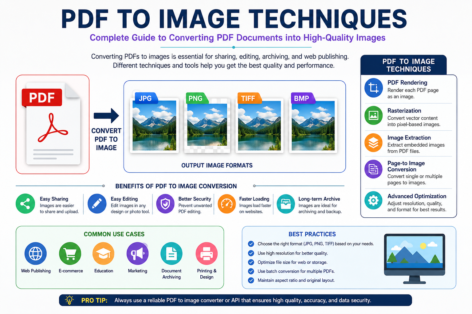
PDF to Image Techniques: The Complete Guide to Converting PDFs into High-Quality Images
The complaint sounded simple. A client had uploaded a PDF brochure to an e-commerce platform, converted it into JPEG images, and suddenly everything looked terrible. Product text appeared fuzzy. Logos looked soft. Fine details that were perfectly sharp inside the original PDF had become difficult to read. Nobody understood why.
The marketing team blamed the designer. The designer blamed the software. The software vendor blamed export settings
After reviewing enough document workflows over the years, I've noticed this same argument appears everywhere. Government portals. Printing companies. Online marketplaces. Educational institutions. Even large enterprises with dedicated document teams run into exactly the same problem.
The reason is straightforward
Most people understand PDFs. Very few understand what happens when a PDF becomes an image. That difference matters far more than people think. The Moment a PDF Stops Being a PDF . A PDF isn't really an image file. That's where many misunderstandings begin. Inside a PDF, text is usually stored as mathematical instructions rather than pixels. Vector graphics are stored as shapes. Lines are stored as coordinates. Fonts are referenced as font data. Everything remains flexible until rendering happens. https://oncepdf.com/guides
Think of it like architectural blueprints. A PDF works similarly. The file describes what should appear on the page. The image conversion process is the moment those instructions become fixed pixels. Sounds harmless. Reality tends to look different.
Once pixels are created, every future action becomes dependent on those pixels. Zooming, resizing, compression, cropping, and sharing all become limited by the image quality produced during conversion.
I've seen organizations spend weeks redesigning perfectly good PDF files when the actual problem was a poor rendering configuration chosen during export. DPI Is Usually the Real Culprit Ask ten users why their converted image looks blurry. Most will mention compression. Many will blame JPEG. A few will blame the conversion tool. The real problem is often DPI. Dots Per Inch determines how many pixels get created during rendering. Higher DPI means more pixel information. Lower DPI means less. Simple enough.
Yet procurement teams repeatedly underestimate its impact. A PDF page converted at 72 DPI might look acceptable on a small screen. The same image enlarged for a presentation slide suddenly looks awful. What looked sharp five minutes earlier now resembles a screenshot from 2008. This happens constantly.
Government departments frequently request document scans at low DPI settings because file size limits seem more important than image quality. Later, the same files must be reviewed, archived, printed, or inspected. The quality loss has already happened. No software can magically recreate details that were never rendered in the first place.
Vector Graphics and Raster Graphics Play By Different Rules
This is where things become interesting. Inside many PDFs, logos and illustrations exist as vector graphics. Vectors don't care about resolution. A circle remains mathematically perfect whether displayed on a phone screen or a billboard. The conversion process changes that relationship entirely. The moment vectors become pixels, they become raster graphics. Now resolution matters.
Every edge becomes dependent on available pixel information.
I've reviewed enough printing projects to notice a pattern. Designers often create beautiful vector-based PDF artwork and then destroy its quality by exporting images at settings better suited for email attachments than professional production. The irony is difficult to ignore. The source file was never the problem. The conversion settings were. Why Text Suffers More Than Most People Expect Text exposes mistakes immediately.
Human eyes are incredibly sensitive to character edges. A slightly blurred photograph may go unnoticed. A slightly blurred sentence becomes annoying almost instantly. Here's why. Fonts inside PDFs are rendered using anti-aliasing techniques. Anti-aliasing creates partially transparent edge pixels that make characters appear smoother. Imagine drawing a staircase. Now imagine sanding the edges until the staircase appears curved. That's essentially what anti-aliasing does. The process looks fantastic when performed correctly. Problems appear when images are compressed too aggressively afterward. Those carefully blended edge pixels become damaged first.
Most users never realize this is happening. They simply notice that text looks "off." They're right. Something is off. The rendering engine created smooth edges, and the compression engine immediately started destroying them.
PNG Versus JPEG Isn't Just a Format Choice
I've sat through enough document management meetings to know this debate never dies. "Should we use PNG or JPEG?" People treat it like a preference. It isn't. PNG preserves data differently. JPEG throws data away. That's literally how JPEG achieves smaller file sizes.
For photographs, that tradeoff is often acceptable. For text-heavy PDF pages, it can become disastrous. A scanned contract converted into JPEG may appear acceptable initially. After multiple uploads, downloads, edits, and re-compressions, artifacts begin appearing around letters and signatures.
Legal teams hate this
Archive departments hate it even more. What looks like a tiny compromise during export often becomes a major headache years later. Transparency Creates Unexpected Problems. Many modern PDF designs include transparency effects. Drop shadows. Glass-like overlays. Layered interface mockups. Soft gradients. Converting these elements sounds straightforward. It rarely is. Transparency relies on alpha channels.
An alpha channel is essentially a visibility map. Some pixels are fully visible. Others are partially visible. Others remain completely transparent.
Think of a frosted glass window.
Modern UI designers rely heavily on these effects
Raw web design trends, tactile brutalism, immersive product pages, and 3D commerce interfaces all use layered visual systems where transparency plays a significant role.
The problem?
Many conversion workflows flatten those layers improperly. The result is ugly halos, unexpected backgrounds, or visible rendering artifacts around objects. The client usually notices. The developer usually gets blamed. The Rise of High-Resolution Screens Changed Everything Five years ago, many image conversion mistakes remained hidden. Today they don't. High-density displays expose weaknesses immediately. What appeared acceptable on older monitors suddenly looks soft on modern smartphones, tablets, and laptops. This creates a strange situation.
The conversion settings haven't changed. What looks efficient on paper can become expensive surprisingly fast. I've watched organizations spend more money correcting automated mistakes than they would have spent manually reviewing the workflow in the first place.
Color Management Is the Hidden Villain
Most users never think about color profiles. Designers do. Printers certainly do. Color profiles determine how colors appear across devices. The same PDF converted by different software tools may produce slightly different image outputs because each tool handles color interpretation differently. This becomes particularly visible with:
1. Brand logos
2. Product catalogs
3. Packaging designs
4. Marketing materials
5. Corporate reports
The differences may seem minor. Until a customer compares versions side by side. Then everybody notices. This is where costs start climbing. Revisions multiply. Approvals slow down. Questions nobody expected begin appearing.
Why Modern Workflows Need More Than Conversion
The market often treats PDF-to-image conversion as a simple utility function.
Upload
Convert
Download
Done